2 Descriptive Statistics
Descriptive statistics are used to describe the basic features of the data in a study. They provide simple summaries about the sample and the measures. Together with simple graphics analysis, they form the basis of virtually every quantitative analysis of data.
Descriptive statistics are typically distinguished from inferential statistics. With descriptive statistics you are simply describing what is or what the data shows. With inferential statistics, you are trying to reach conclusions that extend beyond the immediate data alone. For instance, we use inferential statistics to try to infer from the sample data what the population might think. Or, we use inferential statistics to make judgments of the probability that an observed difference between groups is a dependable one or one that might have happened by chance in this study. Thus, we use inferential statistics to make inferences from our data to more general conditions; we use descriptive statistics simply to describe what’s going on in our data.
2.1 Summary Statistics in R
We’ll use the dataset iris throughout this example. This dataset is imported by default in R, you only need to load it by running iris in the command line.
Here, we load the iris dataset and rename it to df
df <- iris # This is a common name for a single data frame2.1.1 Preview
Below, a preview of the dataset:
head(df) # first 6 observations## Sepal.Length Sepal.Width Petal.Length Petal.Width Species
## 1 5.1 3.5 1.4 0.2 setosa
## 2 4.9 3.0 1.4 0.2 setosa
## 3 4.7 3.2 1.3 0.2 setosa
## 4 4.6 3.1 1.5 0.2 setosa
## 5 5.0 3.6 1.4 0.2 setosa
## 6 5.4 3.9 1.7 0.4 setosa2.1.2 Data Frame Structure
Below, a preview of the dataset’s structure:
str(df) # structure of a dataset## 'data.frame': 150 obs. of 5 variables:
## $ Sepal.Length: num 5.1 4.9 4.7 4.6 5 5.4 4.6 5 4.4 4.9 ...
## $ Sepal.Width : num 3.5 3 3.2 3.1 3.6 3.9 3.4 3.4 2.9 3.1 ...
## $ Petal.Length: num 1.4 1.4 1.3 1.5 1.4 1.7 1.4 1.5 1.4 1.5 ...
## $ Petal.Width : num 0.2 0.2 0.2 0.2 0.2 0.4 0.3 0.2 0.2 0.1 ...
## $ Species : Factor w/ 3 levels "setosa","versicolor",..: 1 1 1 1 1 1 1 1 1 1 ...2.1.3 Summary
To get the summary statistics for each column, you can use the summary function.
summary(df)## Sepal.Length Sepal.Width Petal.Length Petal.Width Species
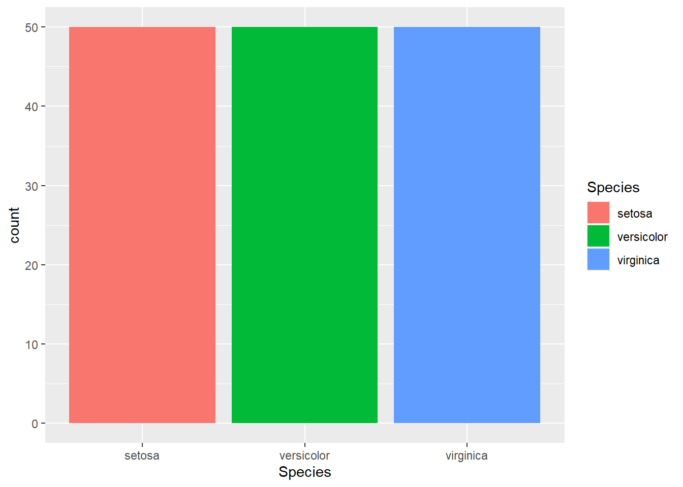
## Min. :4.300 Min. :2.000 Min. :1.000 Min. :0.100 setosa :50
## 1st Qu.:5.100 1st Qu.:2.800 1st Qu.:1.600 1st Qu.:0.300 versicolor:50
## Median :5.800 Median :3.000 Median :4.350 Median :1.300 virginica :50
## Mean :5.843 Mean :3.057 Mean :3.758 Mean :1.199
## 3rd Qu.:6.400 3rd Qu.:3.300 3rd Qu.:5.100 3rd Qu.:1.800
## Max. :7.900 Max. :4.400 Max. :6.900 Max. :2.5002.2 Plots
For this section, we are going to use Hadley Wickham’s ggplot2 package, which is a widely adopted library for plotting in R.
It uses an approach to plotting heavily inspired by Leland Wilkinson’s Grammar of Graphics.
2.3 Histogram
ggplot(data = df,
       mapping = aes(x = Sepal.Length)) +
  geom_histogram() +
  labs(
    title = "Histogram of Sepal Length",
    x = "Sepal Length"
  )
## `stat_bin()` using `bins = 30`. Pick better value with `binwidth`.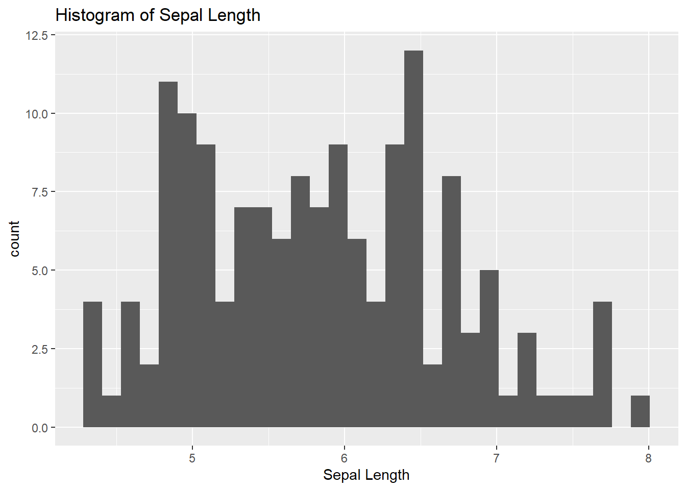
2.3.1 Density Function
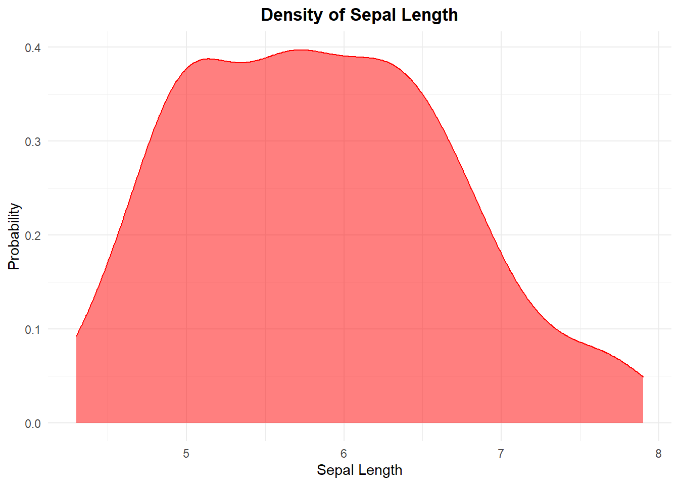
ggplot(data = df,
       mapping = aes(x = Sepal.Length)) +
  geom_density(fill = "red",
               col = "red",
               alpha = .5) +
  labs(
    title = "Density of Sepal Length",
    x = "Sepal Length",
    y = "Probability"
  ) +
  theme_minimal() +
  theme(
    plot.title = element_text(hjust = .5,
                              face = "bold")
  )
2.3.2 Scatterplot
ggplot(data = df,
       mapping = aes(x = Sepal.Length,
                     y = Petal.Width,
                     col = Petal.Width)) +
  geom_point() +
  guides(col = "none")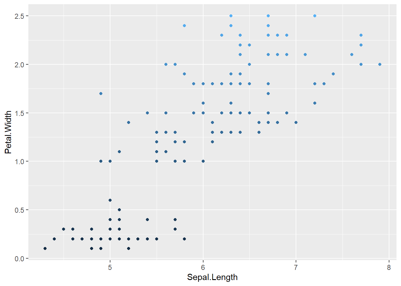
2.3.3 Jitter Plot
A Jitter plot is simply a scatterplot with a certain offset.
ggplot(data = df,
       mapping = aes(x = Sepal.Length,
                     y = Petal.Width,
                     col = Petal.Width)) +
  geom_jitter() + #scatterplot with offset
  guides(col = "none")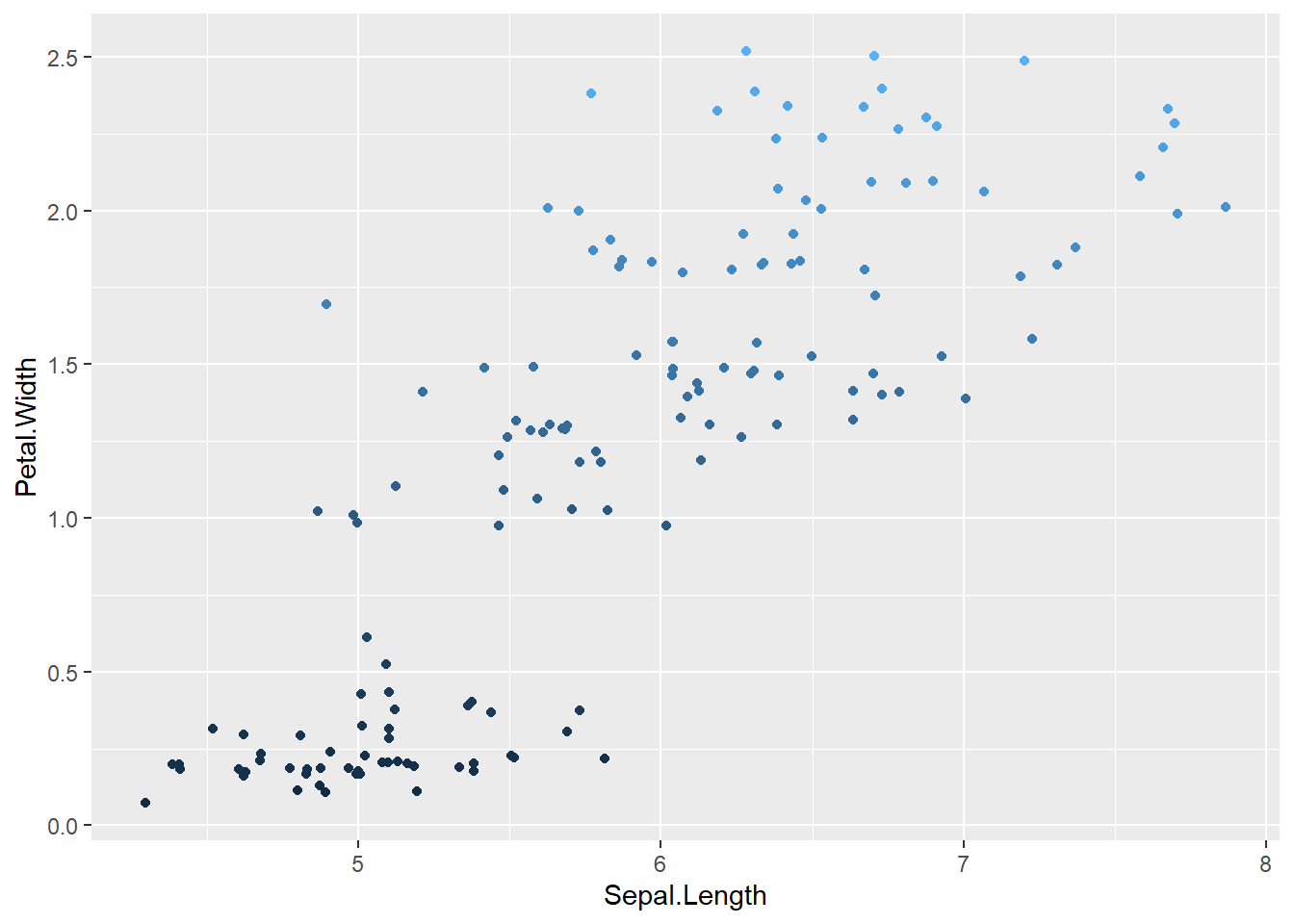
2.3.4 Regression Line
We can add a regression line to the last jitter plot by adding a call to geom_smooth, as in:
ggplot(data = df,
       mapping = aes(x = Sepal.Length,
                     y = Petal.Width,
                     col = Petal.Width)) +
  geom_jitter() +
  geom_smooth(method = "lm",
              formula = y ~ x) + ## Simple Linear Regression, regressing y over x
  guides(col = "none")
## Warning: The following aesthetics were dropped during statistical transformation: colour.
## ℹ This can happen when ggplot fails to infer the correct grouping structure in the data.
## ℹ Did you forget to specify a `group` aesthetic or to convert a numerical variable into a factor?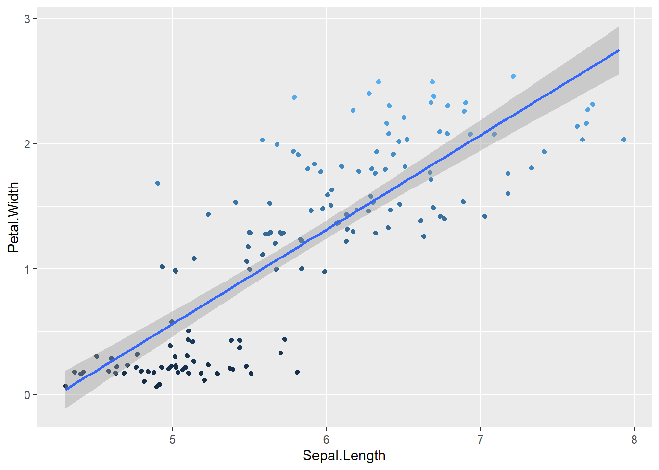
There’s also a couple of things more that you can do, but this is just a template.
